UI / Product Design · B2B SaaS · Benchmark Mineral Intelligence · Market Intelligence
Making complex mineral data feel clear, trustworthy, and human. A full UI design story from components to product.
Benchmark Mineral Intelligence is the world's leading price reporting agency and market intelligence platform for the lithium-ion battery and critical minerals supply chain. Used by EV manufacturers, battery producers, mining companies, and global investors, BMI sets the price benchmarks that move markets.
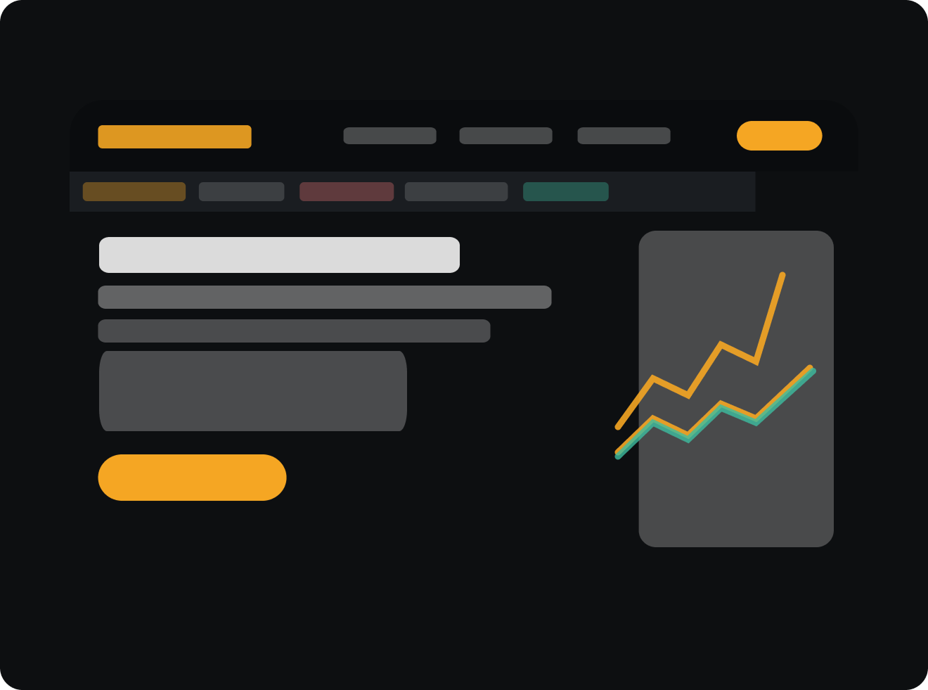
But as the platform scaled, the product experience hadn't kept pace. Data was scattered across inconsistent interfaces, the visual language lacked cohesion, and the design had no shared foundation to build from. Analysts trusted the data, but the product didn't always feel like it deserved that trust.


Our old menu was minimal, perhaps too minimal. With a growing product suite spanning markets, data tools, events, and publications, a simple dropdown was no longer enough.
Enter the mega menu. A deliberate, organised layout that groups related content visually and contextually. Users can now see the full scope of Benchmark's offering at a glance, and navigate to exactly the right place, without the trial and error.


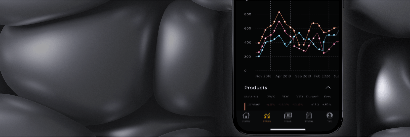
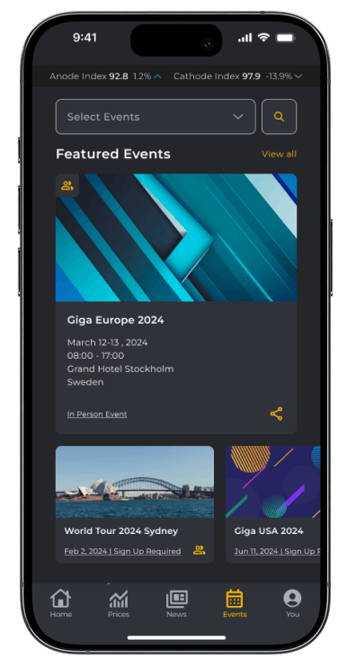
For an organisation that runs events worldwide and serves a global audience of analysts, executives, and policymakers, being mobile-ready isn't a nice-to-have. It's essential. Benchmark's users don't sit still, and neither should their access to the market.
This work covered two fronts: developing new features within the app, and designing the launch presentation page that introduces it to the world. The goal was to create a page that does justice to the product, clearly communicating that this isn't just a companion app, but a full intelligence hub. Prices, news, events, analysis, everything Benchmark delivers, now in your pocket.

Designed to place our innovative products and services at your fingertips, empowering you with the latest data and insights across the lithium ion and energy transition supply chain.
Send me the linkBe the first to receive the latest lithium ion and energy transition supply chain prices from markets worldwide.
Leverage detailed news and analysis to make informed decisions, backed by data from industry experts.
Personalise your app based on the markets and topics that matter most to you.
Download The Benchmark App


 1
1
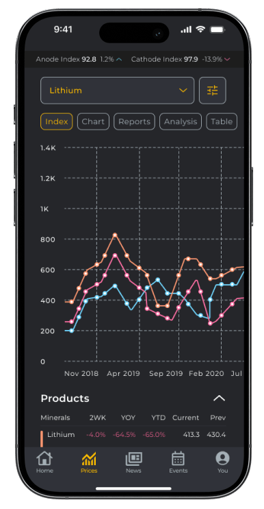
Visualise historical and latest price assessments with dynamic graphs and charts that allow you to track trends and spot opportunities.
 2
2
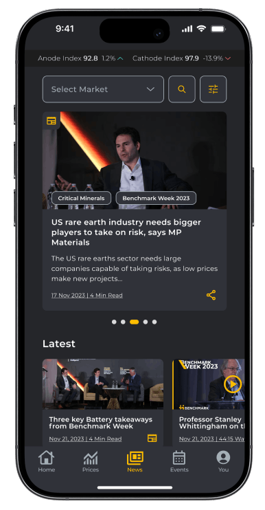
Stay informed with the latest articles and reports from top sources in the lithium-ion battery industry, all curated in one convenient place.
 3
3
Discover and register for key industry conferences, webinars, and networking events that can help you stay connected and informed.
 4
4
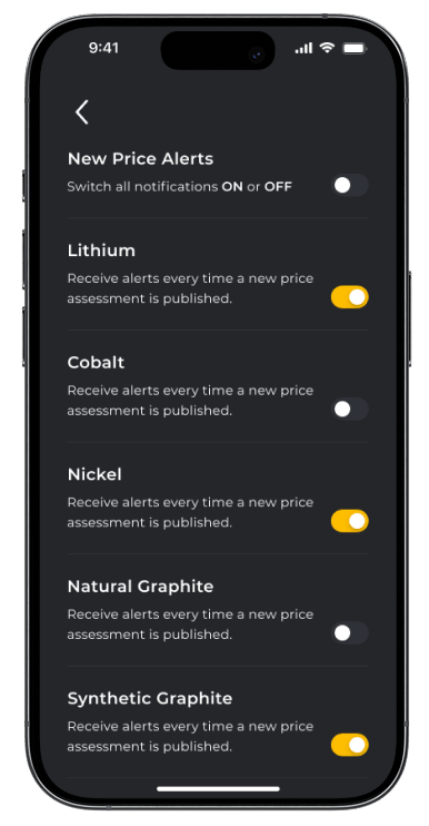
Opt in to receive push notifications directly to your mobile phone ensuring you stay up to date with the latest news, analysis, price assessments and events.


Mobile App Launch Page, Scrollable Preview
 1
1
Visualise historical and latest price assessments with dynamic graphs and charts that allow you to track trends and spot opportunities.
 2
2
Stay informed with the latest articles and reports from top sources in the lithium-ion battery industry, all curated in one convenient place.
 3
3
Discover and register for key industry conferences, webinars, and networking events that can help you stay connected and informed.
 4
4
Opt in to receive push notifications directly to your mobile phone ensuring you stay up to date with the latest news, analysis, price assessments and events across the industry.
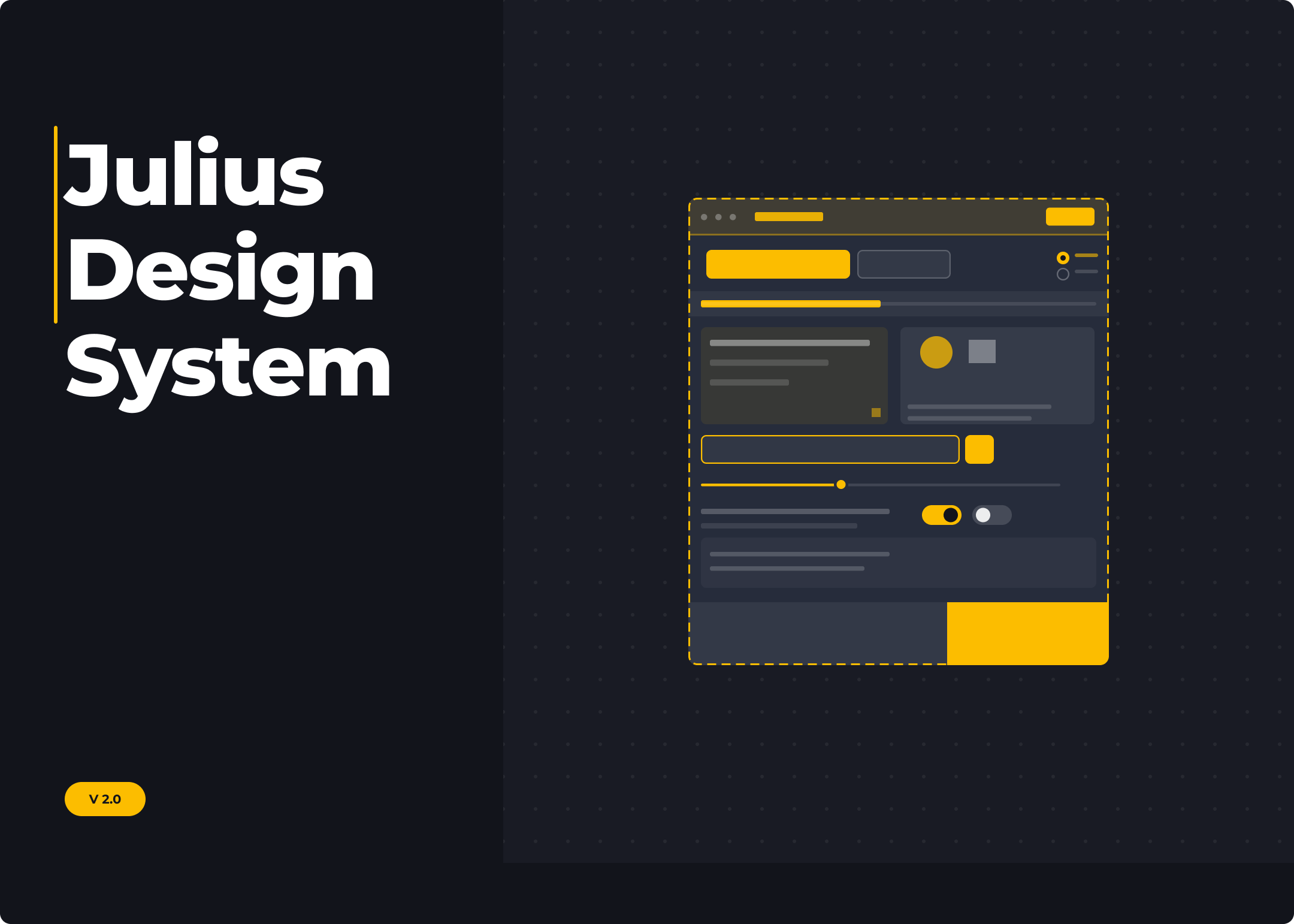
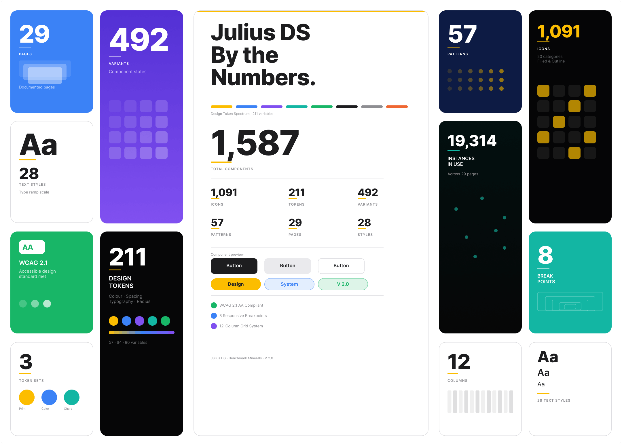
Good design systems do more than organise components. They encode decisions, communicate intent, and make the right way to build things also the easiest way. Julius 2.0 was built with exactly that in mind.
Structured around four principles, Consistent, Scalable, Clean, and Easy, the system covers everything from typography and colour tokens to complex UI patterns. Fully documented and ready to use, it gives design and development a shared language that keeps Benchmark's product aligned across every touchpoint.
Check Julius 2.0
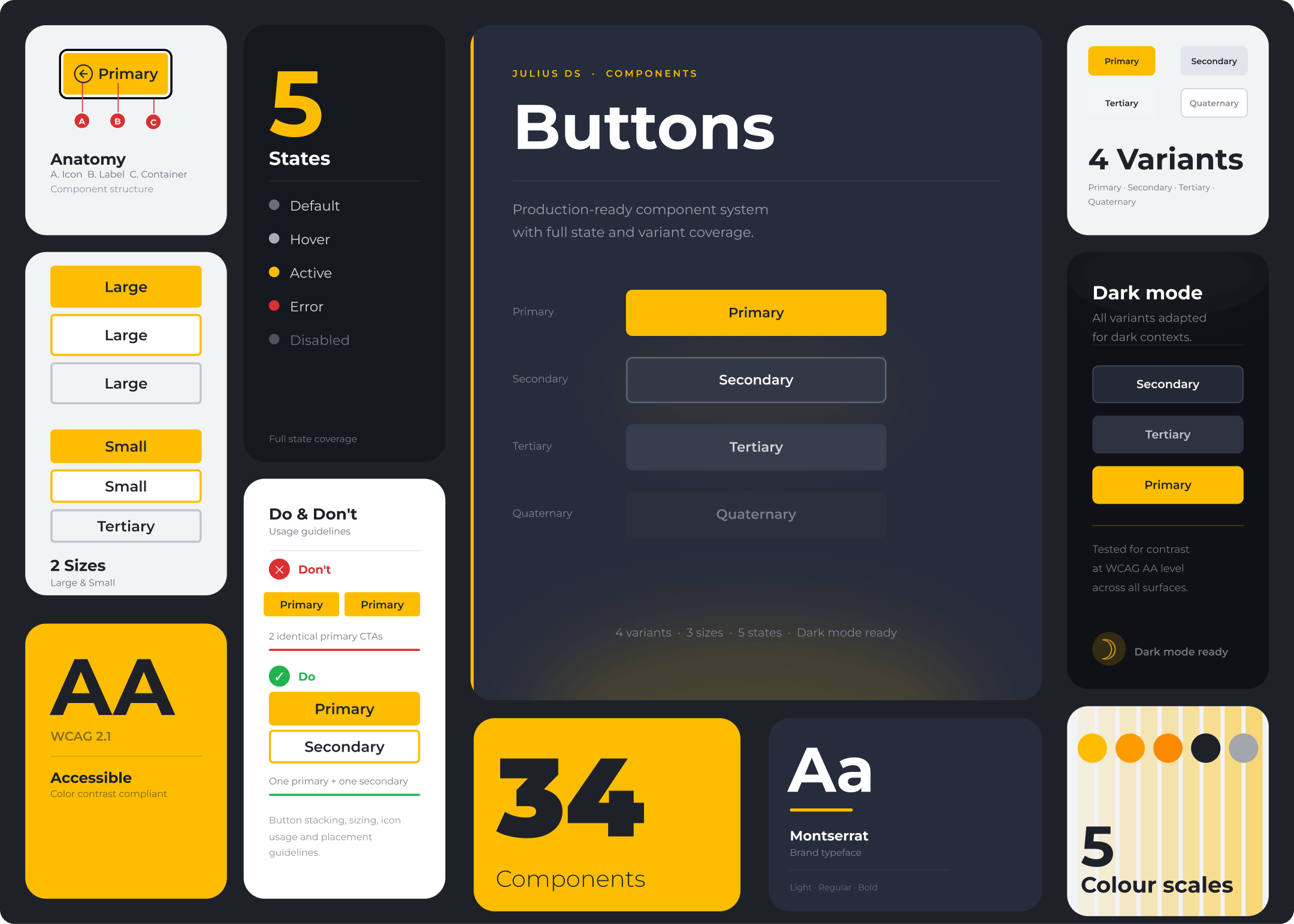
Every component in Julius 2.0 is fully documented, covering anatomy, states, variants, and do and don't usage guidelines. From behaviour specs to accessibility validation, each element is ready for a clean, confident developer handover.


Every component in Julius 2.0 is fully documented, covering anatomy, states, variants, and do and don't usage guidelines. From behaviour specs to accessibility validation, each element is ready for a clean, confident developer handover.

Deep B2B platforms suffer from discovery friction. Users land on one market page and rarely find their way to adjacent opportunities. I designed the Market Compass as a persistent end-of-page component that mirrors the global architecture, letting users orient themselves within the full supply chain, from Energy & Grid to Battery Recycling, without returning to the top nav.
The tree structure creates spatial awareness, while the active state and tooltip cards reduce cognitive load and encourage cross-market exploration.

Shipped to strong reception from both internal stakeholders and customers. Key metrics tracked across the first 90 days post-launch.
+38%
Time on Site
Market Compass and structured content hierarchy drove deeper engagement across market pages
-22%
Bounce rate
Intuitive market architecture reduced dead-end exits and encouraged onward navigation
+60%
App download
Designed app landing page drove iOS adoption in the first 90 days post-launch
+50%
Dev time saved
Julius eliminated rework and streamlined handoff with the external dev team
A few more projects worth exploring. Each one is a different challenge, a different product, but the same attention to craft. From design systems to product redesigns, here is another look at how I work and what I bring to a product.
Cybersecurity · SaaS · 2024
Panaseer
Designing a workflow that turns thousands of security control gaps into a clear, prioritised remediation plan.
Cybersecurity · SaaS · 2023–25
Panaseer
Rebuilt and documented the end-to-end design system with WCAG 2.1 AA baked in as the single source of truth.

